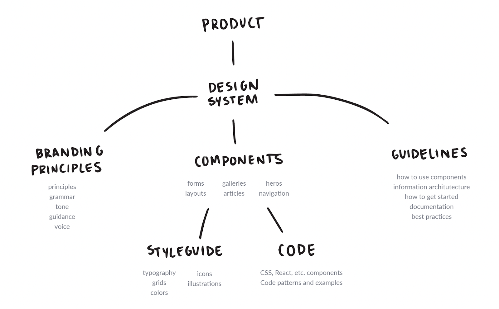
The design system is a foundational framework created to address the growing need for consistency, efficiency, scalability, and collaboration across our product development process across all interfaces and products within our organization.
As the company and its product offerings expanded, so did the design and development challenges, with multiple professionals working across different products, leading to fragmented designs and inefficient workflows. This design system serves as a single source of truth, enabling all teams—designers, developers, and stakeholders—to work cohesively and build interfaces that are not only visually consistent but also scalable and easy to maintain. The design system serves not only to create a cohesive visual identity but also to ensure efficiency in the development process, foster collaboration, and maintain a high level of accessibility for all users.
This document details the rationale behind the design decisions, explaining why specific elements were chosen and how they contribute to the overall user experience and brand identity.
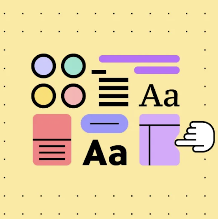
It typically includes elements like:
UI Components: Pre-designed elements (buttons, forms, typography, colors, etc.) that can be reused across a product(s) or website(s).
Design Principles: Guidelines on how to design elements to ensure consistency, accessibility, and a seamless experience.
Brand Identity and tone of voice: Specific instructions on how to use logos, colors, typography, and imagery that reflect the brand identity.
Interaction Patterns: Established rules for how components behave (e.g., hover effects, animations, navigation patterns).
Documentation: Instructions for designers and developers on how to implement the system, and for all other teams to facilitate a strong feedback loop.
Key Objectives
The design system aims to achieve the following objectives:
Ensure consistency: Ensuring a unified design language across all digital platforms and touchpoints, it makes the user experience consistent across platforms and creates a strong brand identity.
Improve efficiency: Streamlining the design and development process by creating reusable components, instead of creating components from scratch each time, teams can reuse predefined elements, speeding up design and development that said both ideation and implementation.
Enable scalability: As products grow, a design system ensures that new features and interfaces align with existing visual and functional standards. It also allows the product to grow, adapt, and evolve without requiring major rework, by using a modular structure.
Enhance collaboration: Facilitating better collaboration between design, development, and product teams, reducing friction in hand-offs and improving alignment on design standards. A shared system allows designers and developers to speak the same language and work more Effortlessly together.
Foster Innovation:With the foundational elements already in place, teams can focus more on creativity and exploring new ideas, rather than spending time redesigning or redeveloping components from scratch.
Problems That a Design System Solves
Before the implementation of a design system at any company I worked for, we encountered significant challenges that hindered the efficiency and quality of our design and development processes:
Fragmented Design
Inconsistent application of design elements—such as buttons, typography, color schemes, and iconography—led to a fragmented user interface across our eight products, each appearing distinctly different. This lack of cohesion confused users and weakened our brand identity.
For example:
Buttons: Different button styles were used across pages, with some featuring rounded corners while others had sharp edges. This variation created confusion and hindered usability.
Typography: Inconsistent typefaces, font sizes, and weights across sections made it difficult for users to efficiently scan content, negatively impacting readability and diminishing the overall visual appeal.
Brand Colors: Each product utilized a distinct brand color, leading to a fragmented brand experience that failed to convey a unified identity.
Iconography: Variations in icon styles across products further contributed to visual disarray, as users encountered differing representations of similar functions.
Content Architecture: The placement and size of input fields varied significantly; for instance, some forms positioned input fields at the top while others aligned them to the left. This inconsistency confused users about where to focus their attention and disrupted the logical flow of information, making it challenging to navigate forms effectively.
The absence of a cohesive design strategy resulted in an interface that did not effectively reinforce our brand identity or provide a seamless user experience.
Inefficient Workflows
Design and development teams frequently encountered inefficiencies due to unclear processes and duplicated efforts, often driven by time and resource constraints. Key issues included:
Component Recreation: Designers and developers often created similar components from scratch instead of reusing existing ones. Common elements like dropdowns, input fields, buttons, and checkboxes were frequently redesigned and redeveloped, each with slightly different spacing, sizing, and alignment. This redundancy led to inefficiencies, wasted time, and a lack of cohesive design across our products.
Disjointed Development: Developers sometimes worked on recreating components independently—either due to the unavailability of designers, who were occupied with other projects, or by relying on incomplete or incorrect design specifications. As a result, developers implemented their own interpretations, which often didn’t align with the intended design.
Conflicting Inputs: In some cases, designs were provided by product or project managers without designer oversight. This led to further inconsistencies, as the final products bore little resemblance to established design principles. Visual elements such as paddings, button styles, and input fields varied widely, complicating the overall user interface.
Difficult Audits:The multitude of variations made it challenging to trace and improve upon existing designs. Conducting a proper UI/UX audit became an arduous task, as teams often found themselves scrambling to fix issues from previous projects while simultaneously trying to meet new product requirements. This cycle hindered progress and left little room to address past mistakes or ensure a high-quality user experience.
Overall, these inefficiencies not only slowed down the design and development processes but also compromised the quality and consistency of the user experience across our products.
Quality Assurance Challenges
Ensuring visual and functional consistency across the product becomes increasingly challenging in the absence of a centralized source of truth. Without a unified design system or well-maintained guidelines, even minor components—such as buttons, icons, and input fields—are recreated in multiple forms across the platform. This fragmentation leads to versions of similar components varying in appearance, functionality, and behavior, often unnoticed until they’re live in the product.
Due to the fragmented design and inefficient workflows, testing and quality assurance become overly complex. Every component exists in multiple variations, making it difficult to verify each one across different screens, user flows, or devices. This increases the likelihood of inconsistencies slipping through to production, where users may experience a disjointed interface or unexpected behavior in key flows.
With so many slightly different versions of the same elements, the QA team faces a significant burden, as it must track and test each instance, which adds to project timelines and increases the risk of errors.
This lack of cohesion between design and development teams further highlights the need for a cohesive, single source of truth—a system that would streamline component use, enhance visual and functional consistency, and ultimately deliver a smoother, more reliable user experience across the product.
Solution: Implementation of a Comprehensive Design System
To address the challenges of inconsistency and inefficiency, a centralized design system should be implemented, providing a standardized approach to design and development. The design system acts as a unified resource:
Reusable Components: A centralized library of standardized UI components—such as buttons, cards, input fields, and typography styles—will serve as a single source of truth, accessible to all teams. By developing, testing, and validating these elements in one location, we eliminate the need for repeated testing of interactions, visual alignment, and other pixel-perfect adjustments across products. Teams can efficiently use these pre-designed, quality-assured components, reducing redundancy and ensuring consistency across all products without recreating elements from scratch.
Clear Documentation: Detailed guidelines and specifications accompany each component, ensuring smooth collaboration between design and development. Documentation covers essential usage details, including spacing, alignment, responsive behavior, and accessibility considerations. This thorough documentation allows developers to confidently implement components as intended, minimizing errors and enhancing the design handoff process. This detailed documentation provides QA specialists with a clear understanding of exactly what they are verifying, ensuring they can identify the correct version of each component and pinpoint areas requiring improvement more effectively.
Quality Assurance Framework: By establishing a single source of truth, the design system enhances adherence to the product’s guidelines and streamlines quality assurance. Both design and code reviews now reference the system as a standard benchmark, ensuring that all new features maintain visual and functional consistency across the product.
Implementing the design system has always transformed workflows across teams, improving communication, reducing redundancy, and creating a cohesive user experience across all products. With a consistent and accessible design foundation, teams can focus on delivering high-quality, brand-aligned user experiences with greater efficiency and speed.
Core Principles
Our design system is anchored by four core principles designed to ensure high-quality, cohesive, and scalable library that aligns with our identity and meets the needs of all users:
Modularity: The design system is structured to offer modular, reusable components that can be combined and adapted to create a wide range of interfaces. Each component functions as a “building block” of the UI, designed with flexibility to fit into various layouts while maintaining a consistent look and feel. This modularity not only reduces design and development time but also ensures that updates can be made to individual components without impacting the entire system, allowing for a streamlined, iterative approach to design improvements.
Accessibility: The design system places a high priority on inclusivity by adhering to accessibility standards, such as WCAG (Web content accessibility guidelines). This commitment ensures that all users, regardless of ability, can interact with our product without any hurdles. Every component - from colors and contrast to text size and interactive elements - is crafted with accessibility in mind, ensuring compatibility with screen readers and other assistive technologies. This principle drives us to create a product experience that is equitable, intuitive, and welcoming for all users.
Scalability: The design system is built to evolve alongside the product, facilitating seamless growth and adaptation. As new features and products are added, the system can be expanded without sacrificing consistency or performance. Components are designed to work across different platforms and screen sizes, allowing us to deliver a cohesive experience that remains consistent even as our product portfolio grows. Scalability ensures that our design and development efforts remain efficient and adaptable in the face of future demands.
Brand Consistency: By using standardized components with unified visual styles and interactions, our design system reinforces our brand identity across every touchpoint. Consistent use of color, typography, iconography, and layout creates a cohesive user experience that aligns with our brand’s values and visual language. This consistency builds user trust and recognition, providing a familiar and reliable experience that resonates with our audience and strengthens our brand’s presence.
Together, these principles guide our approach to creating a design system that is flexible, inclusive, adaptable, and aligned with our brand’s mission, enabling us to deliver a high-quality, unified user experience across all of our products.
Impact on Teams
Designers: The design system frees up designers to focus on innovative and strategic work rather than spending time re-creating foundational components. With reusable, consistent design assets at their disposal, they can prioritize enhancing user experience and creating unique features, knowing that visual and functional coherence will be maintained across the product.
Developers: Developers gain from a robust, well-documented library of components that are ready to implement, minimizing the need to create UI solutions from scratch. This setup removes the common ambiguity associated with design hand-offs, reducing the need for repetitive adjustments and ensuring a consistent user interface. By using standardized, predefined components, developers can accelerate the development process, concentrating on technical optimizations and integrations rather than interpreting design choices or making UI decisions themselves.
QAs: Quality Assurance specialists benefit from a centralized and well-documented design system that provides a clear, consistent standard for verifying user interface elements. With pre-defined components and guidelines, QAs have a reliable reference for what the “correct” version of each component should look and behave like, eliminating guesswork in identifying inconsistencies or defects. This clarity speeds up testing cycles and enhances accuracy by reducing the need to troubleshoot visual or functional issues. Instead of focusing on isolated discrepancies, QAs can direct their efforts toward ensuring product reliability and seamless user experiences across all implementations.
Stakeholders: A unified design language fosters alignment on the product’s appearance and user experience from the outset, allowing stakeholders to confidently review and provide feedback. With established standards and a shared understanding of the product’s aesthetic and interaction patterns, the feedback and approval process becomes more streamlined, reducing revisions and helping deliver a polished, cohesive product to users.
There are many additional disciplines that we can add to this list over time, but overall, each role gains from reduced redundancy, improved clarity, and the freedom to focus their skills on high-impact areas where they provide the most value. This approach ensures that each team member can work efficiently within a unified system, streamlining collaboration across departments.
Whats next?
To build a system that lives beyond its launch, structure and buy-in matter. In upcoming posts, I’ll cover:
Governance: Who owns the system, how decisions are made, and how contribution happens across teams.
Adoption: How to bring teams into the system—through documentation, onboarding rituals, and regular collaboration.
Tooling: What platforms, design tools, and handoff workflows support sustainable scaling.
Metrics & KPIs: How to track usage, identify gaps, and prove the value of the system.
Risks & Challenges: From legacy debt to team resistance—what to expect and how to manage it.
Closing Thoughts
A design system is more than a set of components—it’s an investment in quality, clarity, and collaboration. It helps teams work faster, think more clearly, and build more consistently.
This isn’t a static library. It’s a shared language that evolves with the product and the people behind it.
By building this foundation thoughtfully, we’re not just improving visuals—we’re enabling innovation, reducing waste, and creating space for better ideas to thrive.
Lastest Articles
Lorem ipsum dolor sit amet, consectetur adipiscing elit. Suspendisse varius enim in eros elementum tristique.
